Thursday, 30 April 2015

Pop Art Inspired Photographs!


Let's face it, we are continuously taking photographs,  our phones and computers are overflowing with photographs! and yet not many of us do anything with them...I on the other hand am the opposite, I use photographs in my artwork, and in my journals. I think what is the point of taking them if we don't use them! I call it where art and life collide. As you see below, photogarphs in my journals is one of my very favourite things to use!


Today I am using the Mepxy Design Markers to tint some black and white photographs to make them more quirky and fun for my journal.
As you see, I use photographs all through out my journals, I love documenting our life and my own with photos and then incorporating them into my journals is a big passion for me.

So I sat down and thought about how I could manipulate my photographs without the use of photoshop.

So I printed out some photographs but made them black and white. I always print my own photographs at home as the size I want is a lot smaller than general sizes you can order through photo printing companies.

I grabbed the vibrant Mepxy Design Markers and started colouring. Colouring in has become a huge craze lately so why not colour in your photographs!
with just two markers, I made my simple little black and white photograph into a little bit of poppy colour art! Because you already have the shading int the photo the marker just accentuates the natural shading in the images, and makes it look like you did a lot more shading work than you actually did!
 Making a self portrait look silly and fun is pretty simple, big bright cheeks! I also decided to colour in my scarf! I love how the Imperial Yellow marker looked on my knitted attire!

Using markers on your photos is simple and really effective for something different! if you are a project life person, you could totally do some pop art photos in your spreads to change it up! I adore how these photos looked once I was done playing


I took it a step further aswell, I wanted to use my stencil to do a little bit of text on one of the photographs and the black design marker was perfect for it

These are just simple little steps to make your photographs unique unlike anyone elses.


I grabbed some bright corresponding washii tape from my stash and taped them down into my journal, then decided it needed some more colour, it was then I turned to the primary yellow Aerocolour acrylic ink, now this is the absolute first time I've used these inks, and oh my goodness I should have tried them sooner! They were so bright and so easy to move over the pages of my journal! I will have to create a blog post purely to worship the inks! For now they are a sidekick in the journal spread.

The bright yellow was perfect for the photographs!


Now all I need to do is write a journal entry! 


So do you think its time for you to have a look at your photographs? Make them a little more unique, get the markers onto your photographs and experiment! Create some pop art prints for any occassion! 

Take care and I'll see you next month! 
x Courtney 


Wednesday, 29 April 2015

Full Steampunk Ahead...Art Apron

                                  Full Steampunk Ahead

                                         Pebeo SetaSkrib and SetaColor Opaque paints.

                                                                      Art Apron


Suplies: Setacolor Opaque in white, oriental blue, cornflower, cherry red,orange, buttercup.
SetaSkrib fabric markers form the basic and regular sets. 
Princeton stencil brushes
Princeton round tip brush size 4
Black apron 
Stencils in a steampunk theme watch parts etc

So what is steampunk. Think of it as a mix of sci-fi, sanitary, the industrial revolution, the age of steam power and a plethora of mad, moustached inventors in their top bowler hats and monocles creating weird and wonderful mechanical objects and flying machines. 

I find it a very inspiring and fantastical theme. Your imagination is the driver of your creations, so I decided to label myself an IMAGINEOLOGIST. As  artists we are free to  create the weird wild and amazing and this project is just an extension of that. I hope you have fun with it . So let's go…

Here I taped down a framelet stencil at the top centre
 of the apron, and beginning from the centre and working outward, stippled on the white paint .
stencil brushsize 6 and Setacolor white


Using a variety of stencils, continue stippling on white Setacolor paint.
I used different sizes and fit them kind of like a jigsaw.


Pencil in a circle and draw an eye in
 the top centre frame we first stencilled.
Using the black SetaSkrib marker,
colour the pupil and outline the lid.


Continue adding colours.
 Darker blues add depth.


Using the fluro green marker and the
fluro blue, add layers of colour to the pupil.

here I added black marker to the outer
 edges of the eyelid to create dimension.
Add the 'sparkle' in the eye with white.

A touch of blue , then black help with depth.
Remember to blend while west with a wet brush.

Bow by using the purple marker,
add shadow around the lid.
Blend colour which a wet brush.


A light layer go black ,  and add a little
more white as the highlight on the lid.
Keep going with your markers till you are happy.
Adding layers of the translucent markers
is one of my favourite things. See how the colours vary,
depending  on the colour underneath.


With a light hand, add a little of the red
to the lid. This unites the piece.


Moustache stencil, Princeton stencil brush
and  red and orange Seaclor.
Just under the eye you just painted .
You just gotta have wings.
Red and yellow SetColor add a real pop.
Go a little wild with your markers.
Adding 'scribbles of colour and blend with wet brush.


Keep adding shadow and highlights.
More marker 'scribble' in the colours used
 throughout the piece  unify the colours.


Below the 'moe' I wanted to add a banner..
A nice mix of Oriental blue an white. 
Princeton roundtrip size 4
Cornflower blue and some strokes
of colour in the pupil.


Black SetaSkrib marker in hand, I  added my
Imagineologist title. 


This is how it looks so far.
See how the splashes of colour  brings it all together.

Where will your imagination take you?

                                                                           
                                                                    So till next time…
                                                               Happy creating my friends.
                                                                                xox
                                                                     Kerry Sinigaglia

Tuesday, 28 April 2015

Mepxy Max 6th Edition

MEPXY MAX 6TH EDITION

Deer Crystal

BY Ash Chain
Created with Canson Drawing 220 paper and Mepxy Markers


Good evening everybody and welcome to another Mepxy Max edition. This tute I will be using primarily pastel colours! I love this pallet, you can create so much diversity and depth with just 2 - 3 colours. Lets get started.


So for starters I draw my image with pencils then go over with a black art liner of your choice, doesn't have to be black though! In fact doing it in corresponding colour art liners would look lovely, wish I had thought of that earlier now.


Next step is to choose your colours and get to colouring! I chose a mix of greens, purples blues and pinks as I think they look really nice together.


Instead of my usual blending routine I use a flicking motion creating a clear edge to my colours. Using darkest to lightest I flick to colours out to make the shards look more crystal like then coming in with the lights colour and shading over then whole area. I continued this process over the whole deer and if needed I darken areas which i thought needed contrasting to create more depth.


Finito!


Colours used:  P31, P00, V06, V15, V12, M02, M11, M21, C02, C01, C13, G00, G02, B01


Monday, 27 April 2015

Meet Guest Designer Michelle Wallace.


Meet Michelle.....


Hello all... ..A brief to intro myself........ I am a SAHM to four kidlets aged 17, 11, 7 and 6. I often say that we live in a zoo because of all our animals we have gathered in the last two years (Staffy cross called Nero, tortoise shell cat called Toffee, Fish called Michael, and two guinea pigs called Butterscotch and Drogon). I have been crafting on some sort since a kid. I have mainly focused on scrap booking as my passion for the last 12 years. I have been lucky to share my passion with others and teach here in Adelaide, however have been very quiet on the scrap booking front for the last two years due to changes in my family setup. But in saying that I have had the best year with my work as I have done my best work. My children and I have been through a lot in the past two years and I have used my scrap booking to escape and stay focused on the positives. I craft whenever I can in between currently studying myself and juggling kids sports and calisthenics. I am looking forward to creating with Crafty Crusaders :-)

-------------------------------------------------------------------

I am most excited to be able to share with you my first post EVER on the Crafty Crusaders blog. 
I am looking forward to being able to share with you all what I have able to create using some of the goodies sent to my to play with. 

Now just to explain a little... one of my daughters is turning eight this month. 
For her birthday party she has decided that we are having an Alice In Wonderland Tea Party type of party with a bit of our own twist. 
Now... the twist is that for us there is A LOT of Alice in Wonderland things on the Internet to be able to create for a party. 
However we wanted it a bit more girlie in the twist so we have decided to create our own little bits and pieces for the table centre piece. 
With that in mind we started to chase up teapots to use for the centre piece of the table. As much as we wanted to use mismatch teapots, I wanted them to be personalised a little. 

I have already started the table centre pieces off with creating these goodies..


I managed to find one more teapot that I loved the style of that I just had to alter to finish off the table centre piece.

So with that is mind I would like to show you how I took this  patterned china teapot and made it our own. 

I started off the process by adhering two different napkins (just the single ply of the napkin that is patterned) directly onto the teapot using a glue wash and a #4 Shader Princeton Camel Hair Brush. I then adhered a paper doily that I had cut into quarters where I desired. Then I added a few more pieces of napkin to blend in the doily to the base. For the inner rim of the tea pot, top of the lid and the inner spout I used some Pebeo Studio Acrylic Paint #26 Mars Black to highlight them. I did use two coats to give a nice matt finish. This went onto the shiny surface of the teapot really well too.  

Now.. I found the napkins a little bit bright so using a #4 Shader Princeton Camel Hair Brush I painted the whole teapot with a white wash of  Pebeo Studio Acrylic #41 Vivid White. 
I then let the whole teapot dry before sealing it twice.

Then came the fun bit.  I gathered up paper flowers that I wanted to play around with on this teapot. I had some plain pink paper flowers that just didn't quite match the teapot colours. With that in mind I altered the flowers using a foam brush and some Pebeo Studio Acrylic #41 Vivid White Paint then a smidge of Pebeo Studio Acrylic #50 Magenta just on the edges . It really reminded me of the Queen from Alice in Wonderland when I was painting these.... painting the roses red and all that. 

You can see the large queen of hearts playing card I have altered with white napkin here that I have used as the base of the embellishment cluster. I applied a white wash with Pebeo Studio Acrylic #41 Vivid White over the whole playing card before embellishing over it.

Here you can see I have used some Pebeo Studio Acrylic Paint #26 Mars Black and a dry foam brush to highlight the rim of the teapot and the spout just a little. I have also added subtle highlights to the textured napkin over the whole tea pot too.


I can also tell you too that I have played around with a few of the other paper roses on this teapot too with some of my Mepxy Markers. Once the aqua roses and pink magnolias were adhered to the tea pot I wasn't really happy with the colour match. The aqua looked too green to match the blue of the napkins and the pink magnolia were originally very very pale pink.

I did  the same thing with my Mepxy Brush Markers to finish off this large rose. It was also very pale pink. Just a touch here and there of the markers to the edges and I finally got the effect I was looking for. 
Have had so much fun playing around with creating this teapot and thinking outside the box just a little. Cannot wait to be able to set the table up for the party now. Have one very excited little girl who LOVES her new teapots for her party.

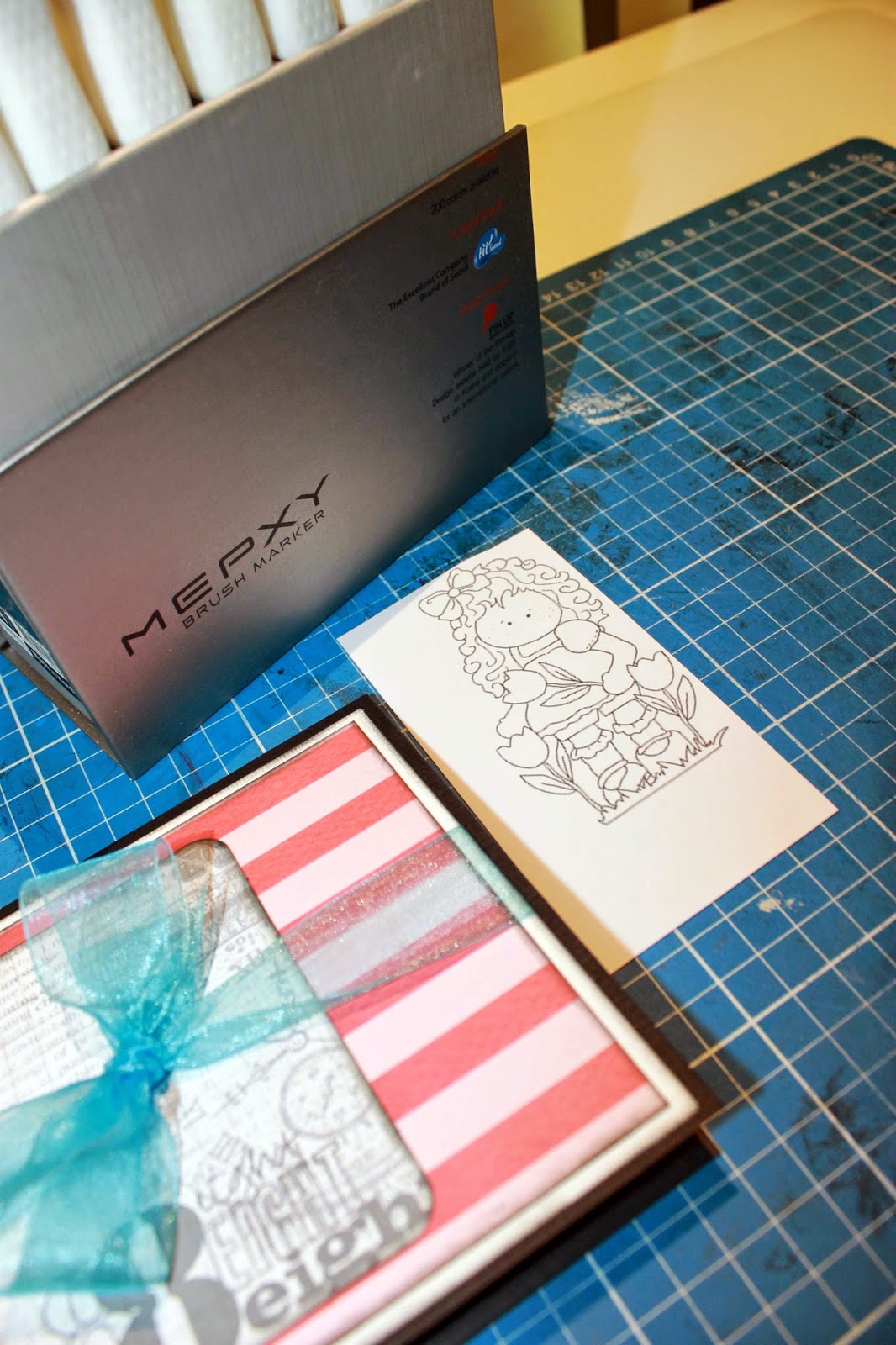
Lastly I wanted to show you the quick card I created using a digital stamp from my stash I have printed onto some Canson Illustration  250 Paper and coloured in using the Mepxy Brush Markers. 

Layered a couple of digital stamps onto a Project Life Graph card for the base age card. then adhered this on some of the matching Teresa Collins paper range I used on the teapots. Added some paper flowers, a chipboard greeting and matching sheer blue ribbon. 

To finish the card off I have printed the little girl digital stamp from my stash onto some Canson Illustration Paper and coloured it very basically with the Mexpy Brush Markers to keep it simple. 
She was then adhered using 3D foam to give a little dimension.
Super quick but fitting with the Alice In Wonderland look.

Well off to play with my Mepxy Brush Markers and some more digital stamps I have printed off.

Till next time. 

Get Creative !!

Michelle W xxx