Thursday 29 October 2015

Painting a little Whimsy girl canvas with pebeo paints

Having fun with pebeo paints and whimsy girls!


Hi there again. Today I'm sharing a cute little project that I made for my son's girlfriend for her birthday. I asked her what she wanted and she said paint me a cute girl!

So here is my guide to painting a little cute canvas with some pebeo paints and some crayons and modelling paste. There's all the requirements in the guide.


Wednesday 28 October 2015

Mepxy meets metal

Embellish metal with Mepxy Markers.


  Adding embossed metal elements to items, such as storage boxes, glass jars, journals covers  and scrapbooking is a great way to add something a little extra. And why not personalise  it by colouring the metal with Mepxy Markers.
By simply colouring the metal before embossing, and adding a few tweaks afterward, you can create items such as I have done here.

Supplies to complete this project: Mepxy Markers in Chocolate, Sand storm, Sepia , Sienna, Black Vivid Blue, Vivid Green, Pine Green and Light Rose.
Sanding block, Paper towel, Rubbing Alcohol,  Embossing plates and dies, Letter punches, images or photos.

Start with your aluminium sheet cut to size. Colour the clean surface with "rusty' tones" like the caramel, chocolate , Sandstorm and Sepia.

Splash or drizzle small amour of rubbing alcohol onto the sheet. Let it pool or run. See what patterns you like in the effect then heat set it.  Run it through the machine in your chosen embossing plate and gently sand back the raised areas.


Llightly run the three blue green markers( pine green, vivid green and vivid blue) over the writing to give a verdigris effect. Now it's ready to go. 


Continue much the same way with just your black marker on the metal, run through your machine, sand back and you've cretaed yet another piece. Perfect for Halloween. 


Why stop there. Using a die cut 'label' run  your black marker over the piece and rub off with a paper towel whist still wet to create a pewter effect. Emboss whatever you like with letter punches. 
This looks so cute on cards and on little jars or milk glasses. 


 For family photos or cute cards, I chose this vintage image, coloured the metal with my light rose marker, rubbed off with a  paper towel and some rubbing alcohol, ran it through  the embossing machine and die, then with the same marker touched up the raised parts  and 'dabbed' it with a dry paper towel.


I hope you feel inspired to create some  of your own embellishments and play with those colours. 
A little tip: Aluminium flashing from the hardware store works the same as the sheets of aluminium from art/scrapping stores. And it's a lot cheaper. 

See you in a couple of weeks with another fu project and tips. 

XOX

Kerry Sinigaglia


Tuesday 27 October 2015

Handwriting with Aryclic Ink

Hello. Felicity here today.

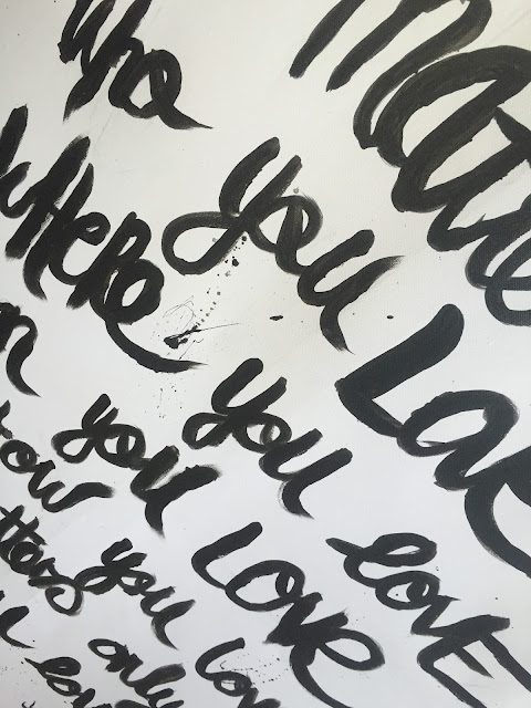
I have always admired the script handwritten canvas. I found a saying I love and decided to have a go with a flat brush and some black arylic ink.

Make sure you prime your canvas first with gesso.


I found that I need to go over the writing about  3 times with aryclic ink.

Something really easy and a good way to get to know how to use Aryclic inks.


Hope this inspires you with your inks today.
Felicity XO

Thursday 22 October 2015

INKTOBER Sun Goddess & Schmincke Inks with Michelle

Continuing  on the INKTOBER theme I have explored with some more ways you can use the Schmincke Inks. These inks are so yummy, the colours are so gorgeous.

I have a quick tutorial for you on how I have created my Sun Goddess.

I have used the Schmincke masking Fluid to mask out some quick features for

Next are a couple of techniques for creating depth in your backgrounds using stencils and stamps.


I have used the Copper, Vermeil Gold & Gold Pebeo Cerne Relief Outliners on the hair and headpiece. I love how these outliners work work so well with mixed media :)


Monday 19 October 2015

Recycle Old CD's and DVD's using Pebeo's Acrylic Paints

This is a great little project for adults and children alike,  I had fun, and I have painted up some extra ones for my kids to play with. These can become Glittery Mobiles, Coffee coasters, pretty Wall hangings. Check out my tutorial below.


Check out How to Decorate and Reuse Old CDs by Siann Watts on Snapguide.

Saturday 17 October 2015

Using Pebeo Prisme Fantasy paints on different embellishments

I'm so excited to be back with a great Pebeo paints tutorial

After some problems with technology I'm back and eager to share a few projects I've been doing whilst sorting out my computer!


Here's a picture of one of the wooden flower embellishments i had fun decorating recently. Below I have created a snapguide for you to follow and see the possibilities using the Pebeo Prisme Fantasy paints with their unique properties. 


I have since used the embellishments on cards and I'm designing a special frame for my niece with the flowers I painted with the Prisme Fantasy Paints. 

Have some fun exploring the world of these wonderful paints and their unique properites that give such a beautiful and unique result every time you use them.


Mepxy Max 17th Edition - Part 1

MEPXY MAX 17TH EDITION

My Darling Deer - Part 1

BY Ash Chain
Created with Canson Drawing 220 paper and Mepxy Brush Markers


Hello all and welcome to a different sort of tutorial. Well not too different. Just BIG and broken up into two parts! Now let's get into it.


I start by lining out my drawing. I use any art liner in sizes 0.8 to 0.2. 


You may have noticed that my sides are missing in the drawing. This is because I used 3M Micropore tape to lone out my edges. I'm trying this technique to see how this tape holds up against the might Mepxy marker. I have used this before with water colour and it has not leaked through leaving my with a shape edge to frame my picture. Fingers are crossed.


Now the fun really begins. I start by using my darkest shade of green and shade the inner most part of the acorn leaf. I then come in with my medium tone and go over the entire area. This helps blend the harsh edges of the darker green. You can see I'm being very cautious with the edges where the tape is as I don't want to be too bold as to assume it won't bleed through.


aFor the wee acorns I use a bright green and a jade green just to make them pop against the incoming tide of green.


Next is the ranch. I only use two shades of brown as I still really want slight contrast in them. I use the darkest brown of them all to create the wood grain effect then go over the entire area with the lightest brown. This, again, helps blend the two together.


The acorn tops are going to be two different colours as the acorns will also be two different colours (mature and immature). I start by speckling the acorn tops with a medium brown tone. I then come through with a light brown on one acorn and a light green (the same one I  used for the tiny acorns) and go over the whole acorn top. This helps the two different acorn top colours to blend with the medium brown tone. 


For the immature acorns I use slimy green colour to contour and shadow it. I them go over with my bright green. One thing to keep in mind is to try not over complicate things. Keep it simple for yourself. When you over complicate by using so may different colours on small objects there is generally a point that the paper will get to where it won't be able to take anymore ink and start to break down. You don't want this to happen. So remember, if you're working on smaller areas, keep it simple to two or three colours.


I repeat the same action for the same process with the mature acorn.


Here is this little corner finished. You can see that the tape may not be working as you can slightly see the marker through it. It was worth a try but this technique was not successful. I will leave the tape on here for now as my guide.

BULK ACORN LEAF SHADING

These next 10 images will show you my process for colouring all the remaining acorn leaves. I use the same technique I used for the first leaf. Start with the darkest of the two greens you have chosen and shade the inner most part of the leaf then go over the entire area with you lightest green. I use a few different greens to create contrast, this will help the picture stand out.


As you can see I continued shading in the remaining leaves and acorns on the deer's antlers as I used the same process as I explained earlier.


The eyes of any creature are my favourite part. It's what brings your art to life. As they say, Eyes are the window to the soul. I whole-heartedly believe that. You can create so much emotion so simply. OK, so I use three colours for the eyes as I want a little more depth. Firstly I used a darker brown and shade just under the eyelid. Then i use a medium brown, a similar tone to the dark brown and shade either side of the darker brown. I don't take it all the way around the iris, just the sides. I then use a mustard yellow to the shade the bottom part of the iris. This helps to liven things up a bit. Sorry that I didn't take step by step photos of this part. I got carried away.


For the pupil I use black the shade the very top followed by a dark grey for the bottom.


I then shade the sides on the eye as I don't want them to be bright white. I used a very light grey for this.


aNow for the nose I use a dark grey and cover the majority of the nose. Then go over the whole area with a medium grey. I try and blend this one quite a bit as the dark grey I used was a bit too dark I thought after. So by going over and over (gently and slowly) i saturated the area where the dark grey was and was able to "bleed" it out with the medium grey.


I then went over the nose methodically with a white art liner and dotted areas to try and create a "wet" look for his nose. I then went over the dots with a light grey as they were so bright and I wanted the dull them a little bit.


For the antlers I speckled them with a neutral brown then I used a "whipping" technique with a dark sandy colour and went over the speckled area. Then I used a very light sand tone and went over the remaining area of the antler and blend (only slightly) the light sand tone and the darker sand tone. I also used the dark sandy colour over the antler sporadically to create some small depth in the antlers. I continued with this same technique over most of the antlers. The still blank parts I have planned to do differently. Stay tuned for part 2!


That's all folks. I hope you have enjoyed the first instalment of this tutorial. I'll be back next week with part 2! Many thanks for all your support everyone :)

Colours used: 00, 120, NG05, NG06, NG07, NG08, NG10, N52, L25, W39, N27, W37, N18, N25, N54, Y19, L67, O27, G28, W35, L24, N50, N07, G99